Using the CMS
A few tips for using the system
See also CSS examples »
To note:
On a desktop computer a line of text in this main column contains roughly 85 characters, the maximum often regarded as readable. It will be much less on a mobile phone and equally readable, perhaps more readable. This column can be made a bit narrower on a desktop screen by using the HTML section element, which narrows it from 740 pixels wide to 600 pixels.
<section>
Content text, 600 pixel wide image etc ...
</section>
(01) Navigation menus
Don't add too many items to the main menu and use only one or a couple of words as [anchor text]. If the menu gets too wide it will stretch beyond the width of the content column and look clumsy, especially on narrow screens. If more links are needed put them in a suitably named page and put the page in the menu.
(02) Video
The following markup adds mp4 video to a page:
<div class="video">
<video width="480" height="750" autoplay controls loop>
<source src="./video/filename.mp4" type="video/mp4">
Your browser does not support the video tag.
</video>
</div>
Make sure to put a dot in front » ./video/filename.mp4 ...
Note: .mp4 files can't be uploaded in 'Images' due to their larger file sizes. They will need to be uploaded separately via ftp into the /video/ folder or called in externally:
<div class="video">
<video width="480" height="750" controls loop>
<source src="https://example.com/path/video-filename.mp4" type="video/mp4">
Your browser does not support the video tag.
</video>
</div>
When supermicro CMS is installed under SSL, external .mp4 files must come from a secure https source, not http, or they will not display.
(03) To add a YouTube video to a page:
(04) To make images full-width on small screens:
By default, all images are contained in an HTML paragraph. On narrow screens, paragraphs don't extend right to the edges but have a small side margin right and left. That applies to images as well. To let an image extend right to the edges on narrow screens, enclose the image in paragraph class "w" as follows:
<p class="w"><img src="img/filename.jpg" width="xxx" height="xxx" alt=""></p>
Wider screens are not affected.
(05) 'Extra' files
The /inc/ folder contains three 'extra' files: extra-head.php, extra-body.php and extra-content.php which can be used to manually add code, content or a Facebook share button to the standard template. extra-head.php already contains Open Graph meta tags and extra-content.php contains slideshow JavaScript so be careful not to disturb what is already there.
To see exactly where these files are located, see HTML page structure or the source of this page.
(06) Unjustify paragraph text
Paragraph text is 'justified' by default. To unjustify it, add the following to the extra.css stylesheet:
@media screen and (min-width: 798px) {

  #content p {
    text-align: left;
  }

}
In Styles / Select a stylesheet select Extra styles only, paste it in then Update styles.
(07) Hide pages from site search
To prevent a page from appearing in on-site search results, add two consecutive caret symbols #~~ to the first line of text.
(08) Prevent a page being copied
To prevent a page being printed, to block 'view source' and prevent 'select/copy', add X to the first line of text. Not desirable but doable.
(09) Hide 'Page last modified: ...'
'Page last modified: [date]' can be removed from all pages by adding the following to the extra.css stylesheet:
#content p.meta {
  display: none;
}
In Styles / Select a stylesheet select Extra styles only, paste it in then Update styles.
(10) Narrower text column
To make text more easily readable on desktop computers and laptops, the width of the text column can be narrowed from 740 pixels wide to 600 pixels:
<section>

Content text

</section>
Images and video can be included if they are 600 pixels wide or less. If they are wider, then close the 'section' just above the image (or video) and open it again underneath:
<section>

Content text

</section>

<img src="img/filename.jpg" width="xxx" height="xxx" alt="">

<section>

Content text

</section>
(11) Using images wider than 740 pixels
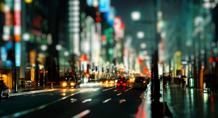
Some of the features illustrated below may not be visible on narrow screens, eg: mobile phones and some tablets in portrait mode.
On screens with a width of 1257 pixels and over, a 1200px wide image will show full-size but will reduce in stages on narrower screens to 1024 pixels, 860 pixels, 740 pixels, then shrinking further on smaller devices.

Example image 1200 pixels wide
The markup:
<div class="w1200">

<p class="w"><img src="img/filename.jpg" width="1200" height="628" alt="" ></p>

</div>
Set image filename and size as actual image.
(12) Put rounded corners on an image
Add class="rc"
<img src="img/filename.jpg" width="1200" height="628" alt="" class="rc">
As the image above.
(13) Full width backgrounds
From 16th July 2020 the download stylesheets allow a full width background to be added to any block-level element (including most images). This is done by adding class bgmaxw1, bgmaxw2 ... up to bgmaxw9 (all different colours). Example:
The markup:
<img src="img/example-image.jpg" width="740" height="400" alt="" class="bgmaxw4">