Full width 'responsive' images
Version 6.0 onwards, from 15/08/24
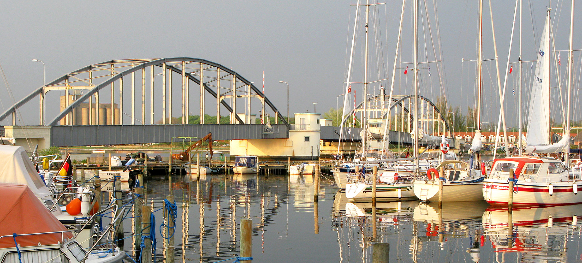
Guldborg Marina, Denmark
Photo by Patrick Taylor
The photo above has no 'max-width' so fills the screen horizontally regardless of its width. It's over twice as wide as high (in pixels) so that while it fills the screen horizontally, the full height of the photo should still be visible without too much vertical scrolling.
The width of the image can be limited to it's 'physical' pixel width. A 1200 pixel wide image for example can limited to 1200 pixels in width with style="max-width: 1200px;" (optional). The remaining width of the screen can be given a background shade with (as an example) <div class="max" style="background-color: #555;">.
The markup (without a background shade):
<div class="max">

<img src="img/sofia-1200.jpg" width="1200" height="628" style="max-width: 1200px;" alt="">

</div>